My Instructional Design and Technology class a week or so ago was discussing WebQuests as an example of a scaffolded information problem-solving task. I assume folks who read this blog have memories of the popularity of WebQuests. I say memories because even good educational ideas seem to fade as newer things come along.
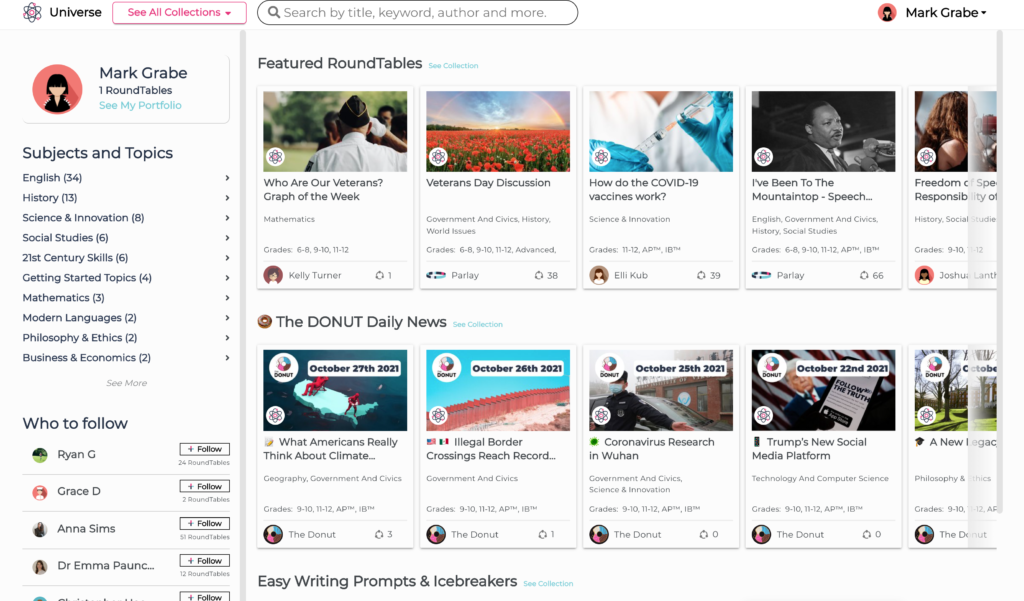
I conclude my classes by having a student volunteer or me when no one has something to present offer a short description of a tech tool or service they feel educators should explore. A student described Parlay – a tool intended to help educators structure discussion. We noticed some similarities of the structure of a Parlay discussion and WebQuest and decided the Parlay approach might be a way to extend a WebQuest into a discussion or a debate.
A Parlay “design” is organized into four components – goals, content, discussion questions, and peer responses. Parlay offers a collection of lessons within what the service describes as the Parlay Universe.
You can also choose to create your own lesson and assign it to a class or maybe eventually contribute it to the Parlay Universe.
I have a favorite WebQuest called the “Snow Goose Dilemma” I created many years ago. I redid this exercise using Parlay and a YouTube video I found within Parlay.
Parlay generates pseudonyms for participants so responses to the discussion questions are anonymous (the teacher has access to a dashboard that provides actual identities and other information about student activity). Other students are then invited to offer feedback (respond) to the question responses. Depending on the content and discussion questions this could easily become a format for lessons in argumentation.
Parlay offers educators a free trial with a cost of $160 per year. This price likely will put many off because it may seem a service one would use occasionally. The company sees things differently. It is too bad there are not other more intermediate opportunities for participation.
I was a big HyperCard fan and had a great time using the capabilities of that application to create interesting projects. I was interested in creating virtual learning environments and came up with a concept I called Grandma’s Attic. The idea was that an attic contained all kinds of content that might be regarded as historical artifacts. One could create a virtual attic and have learners explore this attic to collect information to respond to specific requests.
HyperCard offered some capabilities I cannot find in the multimedia tools now available. It had a scripting language and it made use of an object-oriented approach with some interesting capabilities. You could stack objects on top of each other and on top of a card. An object you clicked on would respond to the click if a handler existed or the click would fall through to the next layer (background, card, stack, HyperCard). So, for example, a click on an object on a card might trigger movement to a different card showing that object in a different state (say a closed book to an open book revealing text).
I was reminded of this capability and wanted to see how closely I could mimic some of these capabilities in Google Slides. If so, there would seem to be interesting capabilities for the creation of something like the virtual environments I created in HyperCard.
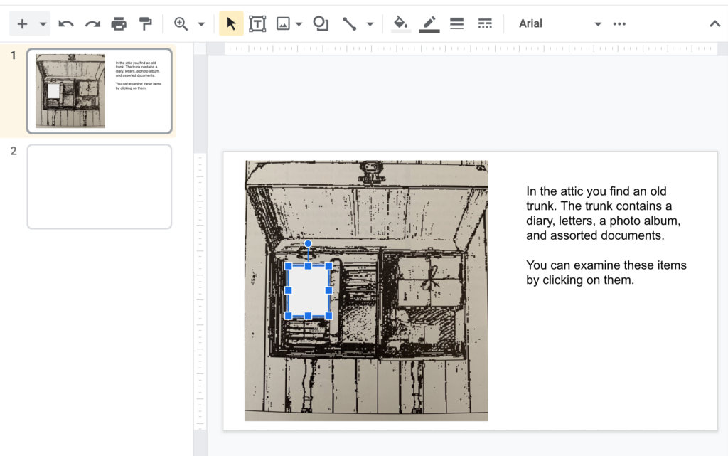
I actually found a screen capture of one of the displays from the HyperCard activity I created many years ago. One of the objects in one of the attics was a trunk containing stuff – a diary, bundle of letters, photo album, etc. It was easy to bring this image into Google Slides and then use a text box to offer some context about the image.
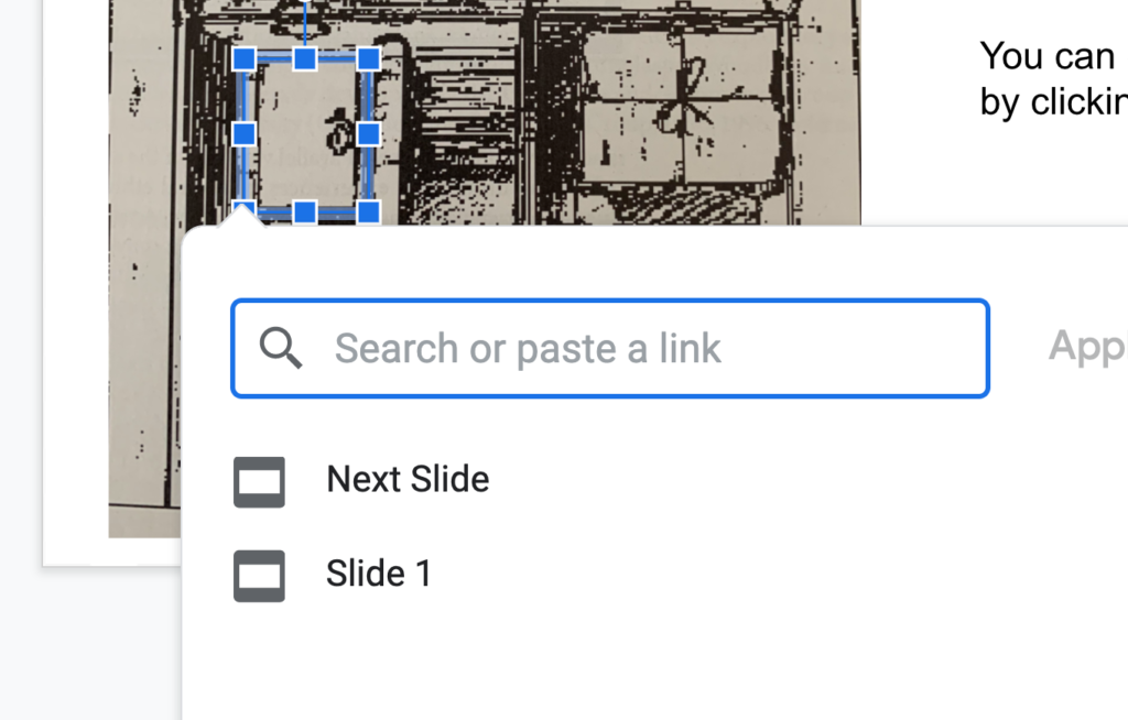
Slides has the capability of attaching links to objects. I used the square object from Objects and covered the diary.
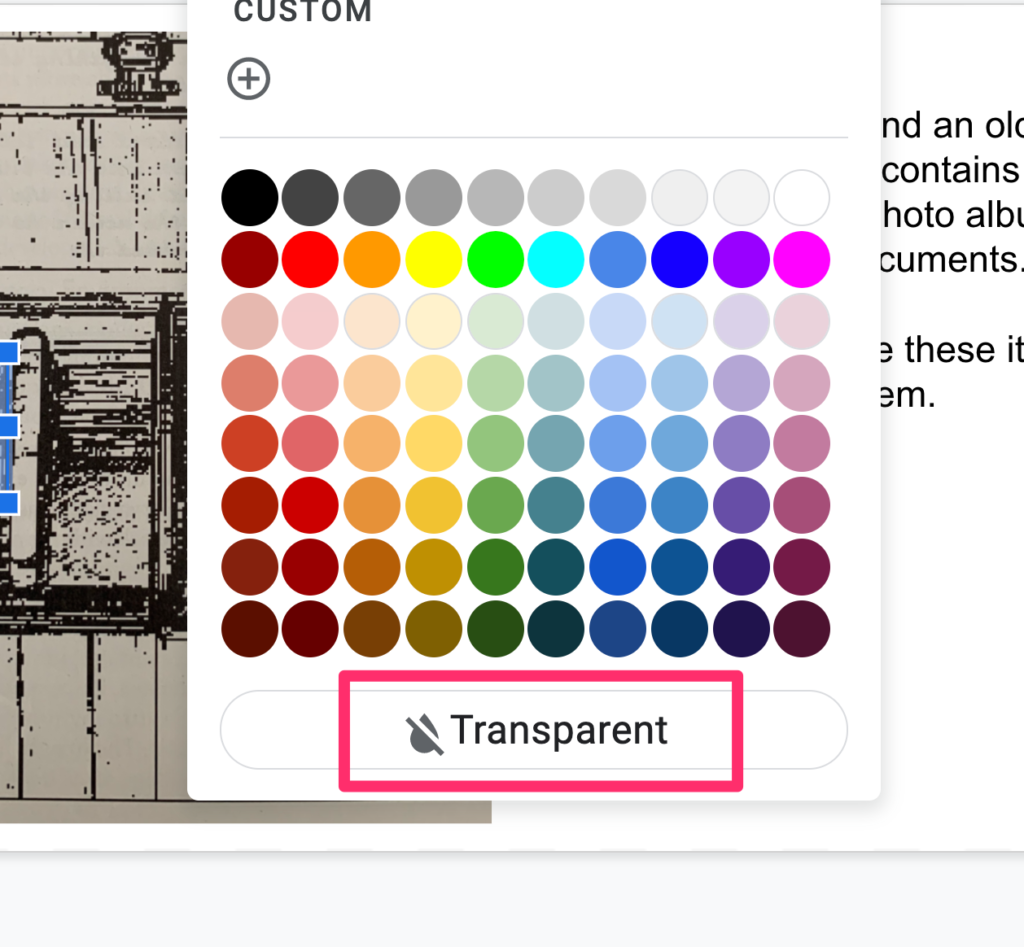
Objects can be filled with various colors. Grey seems to be the default. I wanted the square object to be invisible and found you can set the fill to transparent. A thin line does mark the location of the “invisible button”, but this seemed fine.
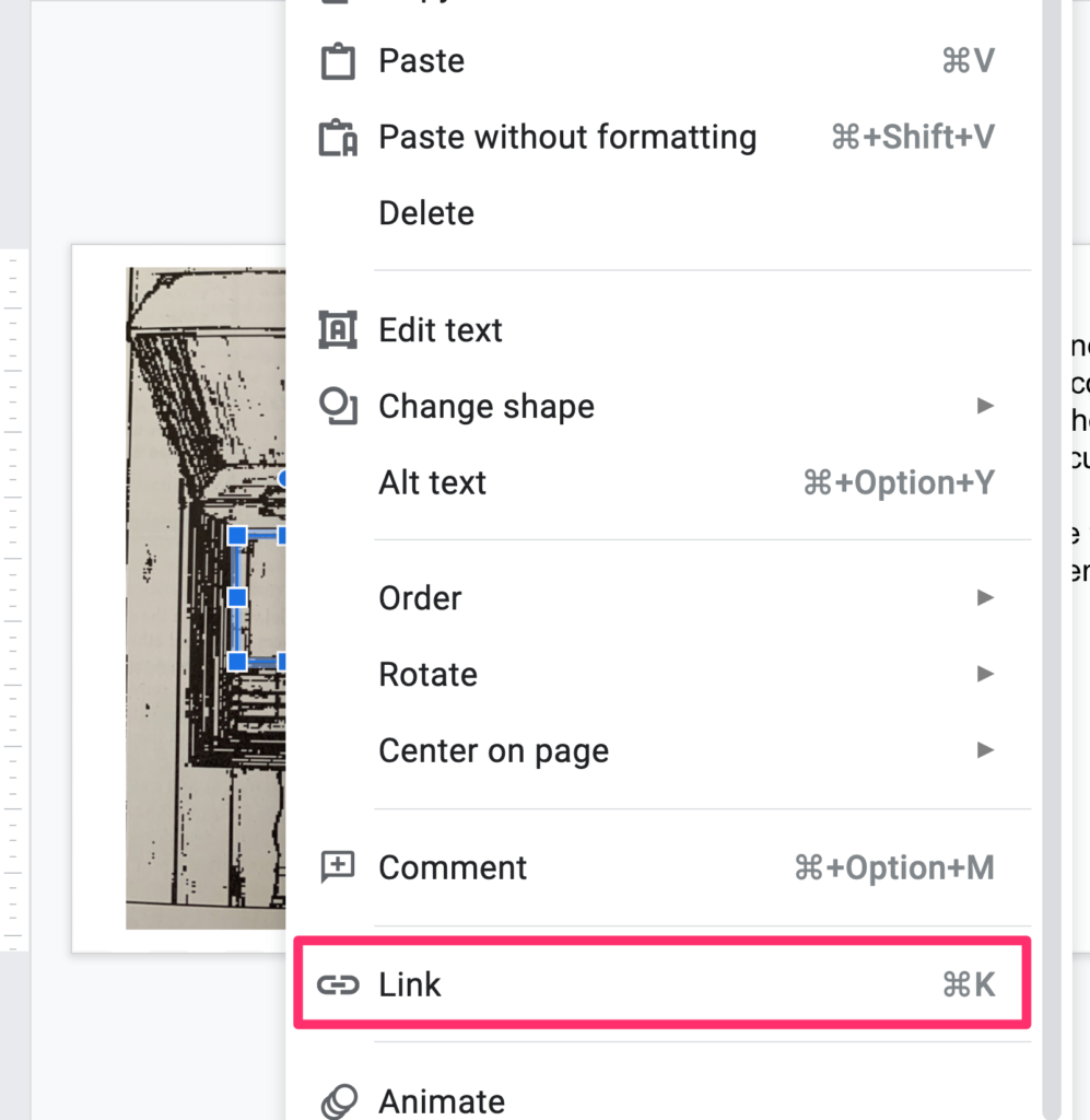
This is the tricky part because it is not obvious from the menu bars that this capability exists. If you right-click (control-click) on an object, this list of options appears. You can use the “Link” option to create an action when the shape is clicked. In this case, I wanted to sent the user to a different slide. Note that the idea would be to have multiple objects used as hotspots to send users to different slides.
So, imagine clicking on the diary and you end up viewing a diary page (just a text field on another slide).
You do need to understand some other features of Slides to approximate what I used to do with HyperCard. First, images, shapes, text boxes appear on slides in layers. You might not notice this unless one object overlaps another. Obviously, you need the invisible button on top of the image of the diary/trunk. Use the “Order” option available in the same menu used to connect a link to an object to manipulate the order in which different objects are layered on the slide.
When you force a tool to do things the designers of that tool did not anticipate, you often have to use creative hacks to get what you want done. Here is an example. Slides is designed to advance slide to slide and not necessarily to jump around using linked buttons. You really want to disable the card to card progression if you can. In the example of the trunk, you don’t want mouse clicks on surfaces other than those covered by invisible buttons to move the experience to the next card. The next card would not necessarily make sense to the user. Here is a kludgy remedy. Start with an invisible button that covers the entire slide and link this button to the same slide. Instead of moving to the next card, clicking elsewhere on the slide will result in no change. The clicks trigges a link that takes the user to the same slide.
This is not a perfect solution as clicks on other objects that cover the all slide invisible button still move the experience to the next slide. This seems a problem that would be very tedious to fix. Perhaps changing the outline of the invisible button to something more visible would encourage willing users to click where their actions would take anticipated consequences. Not exactly the kind of expectation good designers tend to make.
This project was intended mostly as a proof of concept encouraging others to explore with slide-based systems (e.g, Google slides, PowerPoint) and see what atypical applications are possible. The example I use here is unusual, but this technique of using multiple objects to control links to multiple slides is a technique suited to many applications.
Back in the day when you had to purchase records and listen to music on the radio, there used to be stations that carried a weekly top 40 show during which the program host would count down (play) the most popular songs of the week from the bottom to the top. Thinking about the title now I would have to guess at why 40 was the magical number. I asked Google and speculation was that 40 was the number of 45s a jukebox held or the number of songs that could be played during the most popular shows.
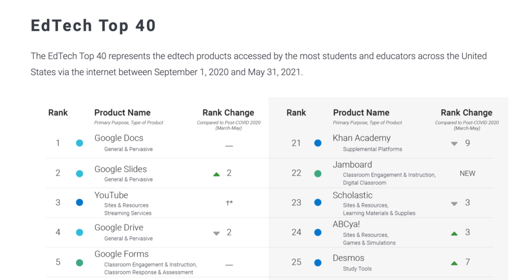
I came across an annual top 40 that lists the popularity of EdTech Top 40.
Learn Platform makes an extension available that allows the use of applications to be quantified. The company can then provide data on use at a national level, but individual districts can also collect data on use within a district. The company proposes that it may be helpful to identify whether intended applications are actually being used and to identify applications that just show up.
The company collected data from more than 250,000 educators and 2,000,000 students during this past year. The composite data allow an interested party to consider the most popular edtech services used by educators or students across 10 different categories. The voluntary nature of participation (at least at the level of a district) could easily bias the data collected as far as what typical use might be, but the relative rank of different applications and changes from one year to the next could be useful especially to those of us who from time to time comment on trends and perhaps make decisions about the preparation of future educators.
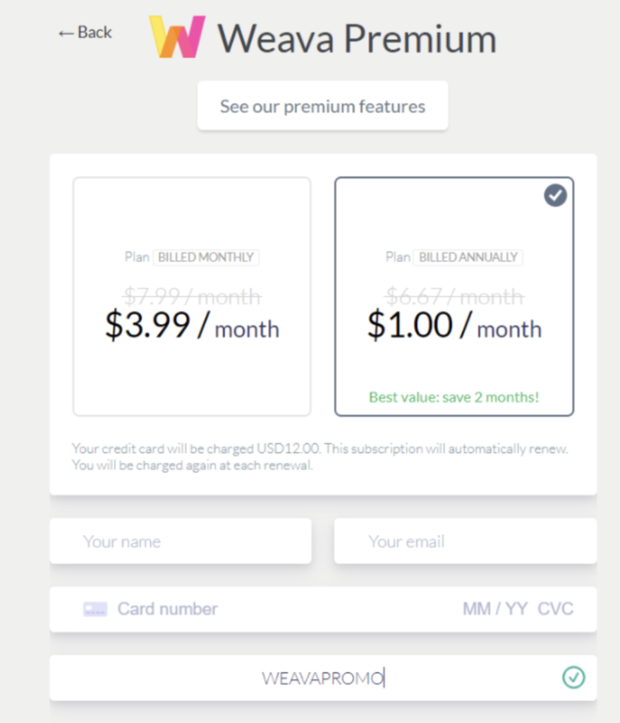
Weava is another of those tools attempting to provide an efficient and powerful way to do Internet (and pdf) research. It is a browser extension that allows web pages to be highlighted and annotated, to organize the information that has been determined to be valuable by the user, to export this information, and to collaborate with others in online research. There is a free version of the service and a paid version. I think with a coupon the present rate is $12 a year, but I have also found prices of $7 and $4 a month.
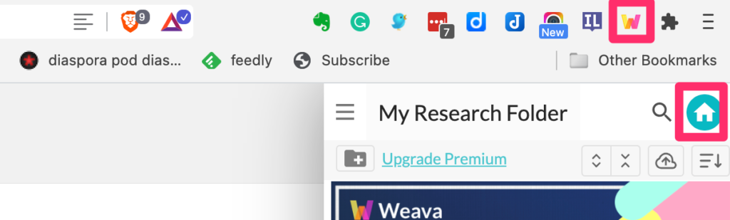
Like many extensions, Weava is activated and deactivated from the browser menubar. This will bring up a side panel that provides access to various features – e.g., the active storage location for highlighted pages. The “House” icon provides access to the service dashboard. Explore the dashboard to become familiar with all program features.
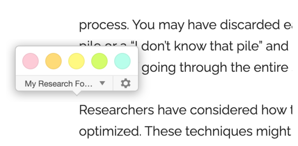
Once activated, Weava will bring up this small panel each time text is selected. The panel shows the active storage folder and allows the selection of the highlight color. Weava recommends using different colors to indicate different types of information.
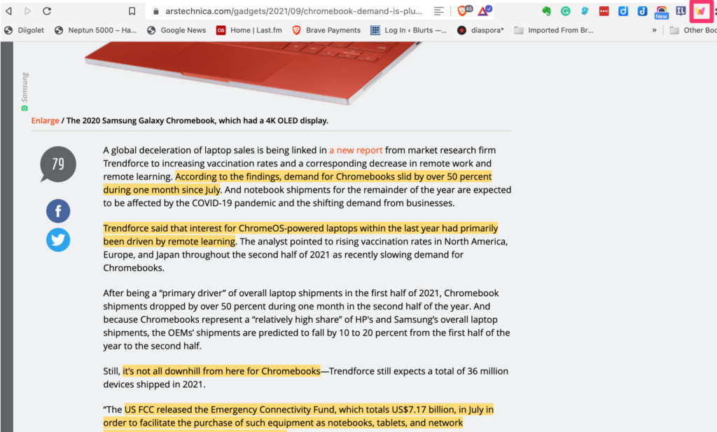
In the images below, you can see a page with highlighted text.
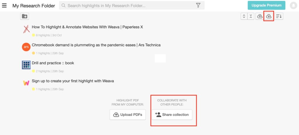
From the Dashboard, a user can accomplish multiple things. You can share the highlighted material stored in a folder.
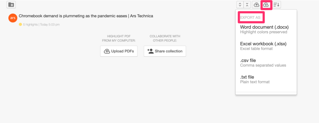
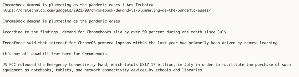
You can export the additions you have added to web pages you have read. The content can be exported in multiple formats. You can also generate a citation stored with a link for the annotated pages.
The present pricing structure (beyond the free version) has been reduced during the pandemic.
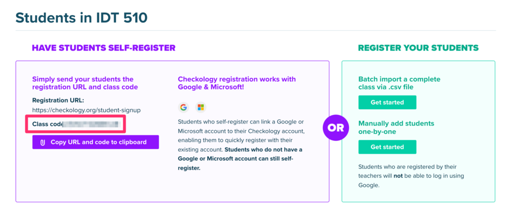
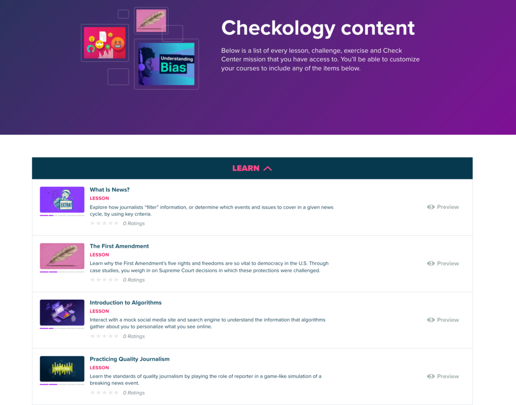
Checkology is a great resource for educators or any individual interested in developing the skills of news literacy. It is a free and complete instructional resource – lms for creating classes and making assignments, instructional content, skill evaluation tasks, and open-ended resources for further exploration.
Educators can designate a class, select content, and invite students into the learning environment.
Google has released an app for taking handwritten notes named Cursive. Cursive can be obtained from https://cursive.apps.chrome rather than the Play Store. The app works by progressive download so it works a little differently than other apps.
I have explored Cursive and will offer some basic comments below. I would not personally use Cursive, but I would not rely on handwritten notes on paper or any digital device because of the quality of my handwriting and because I can simply take notes more effectively from a keyboard. Cursive is not unique in allowing handwritten notes, but it is free and intended for Chromebook users.
Some observations. I have a Chromebook Pixel, but cannot see using this device because while it has a touch screen it is designed in the form facter of a typical laptop and extended writing on the screen does not make ergonomic sense. I explored Cursive with my Acer Tab 10 tablet which is a native Chrome device. It is several years old and probably underpowered by today’s standards. My assumption is that Cursive was designed for a Chromebook convertible or flip device.
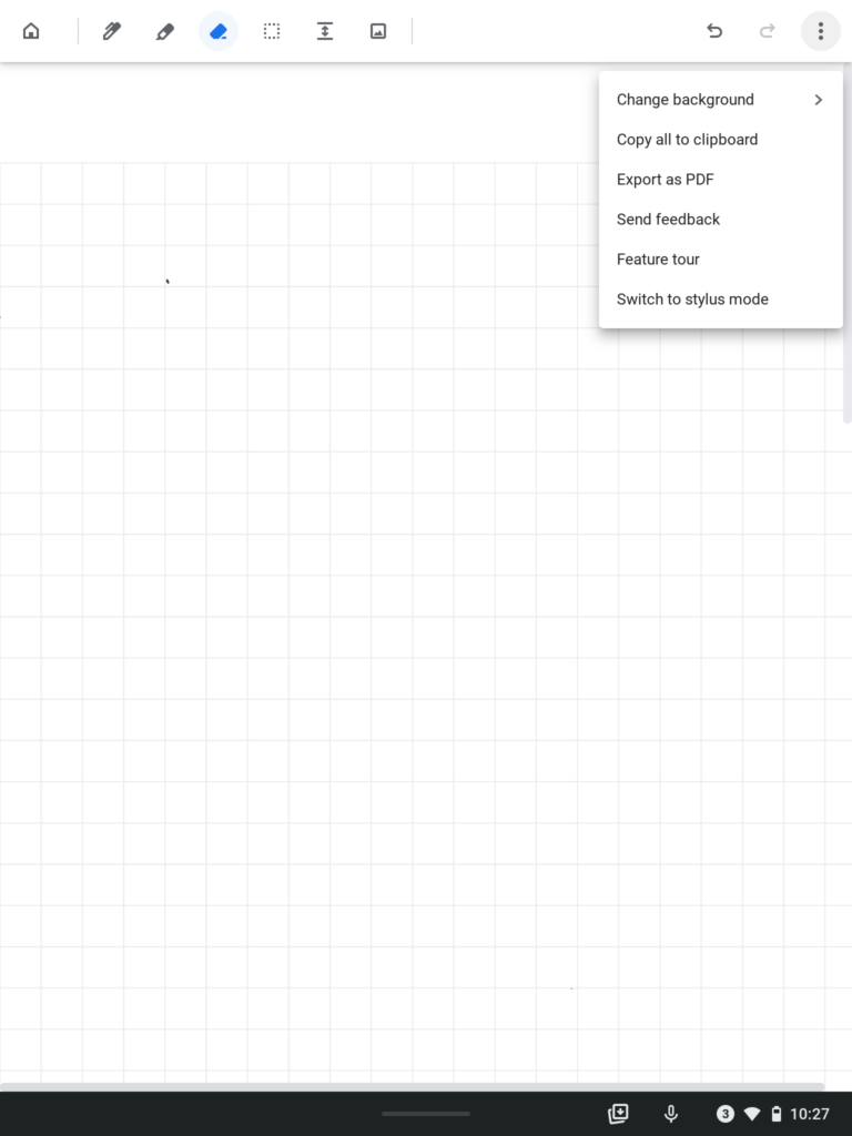
The following is the Cursive interface with the tool options across the top of the screen and other options (e.g., copy to clipboard, export as pdf) available from a dropdown menu. The tools include a pen or brush, an eraser, a way to extend the keyboard, and to import images.
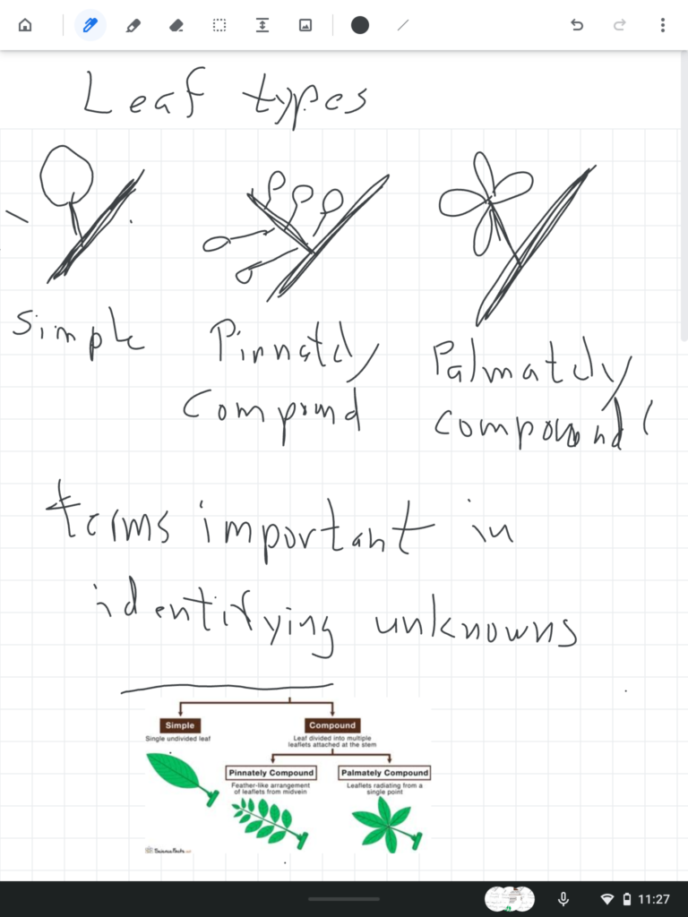
Here is what my effort to hand write notes generated.
I tried to generate notes at a rate I think might be necessary to record notes in a class. My handwriting is this bad. I also was using a short stylus (I call it golf pencil length) – my Apple pencil does not work with other touchscreens. Even with an older tablet, I found the lag (time between a movement and consequence appearing on the screen) to exist, but not present a serious problem. The issue that did frustrate me was the requirement that I not touch any part of the screen (e.g. my palm) while trying to write or draw. This creates a strained writing posture that has to limit the quality of what is put down and would become tiring when taking notes during a long presentation. Apple has found a way around this issue, but I cannot speak to whether solutions have been found on other chrome devices.
My recommendation – if you have a Chrome device that you would like to use to take cursive notes, I would suggest you give Cursive a try. It is easy enough to add to your device and learn to use and it costs you nothing to give it a try.
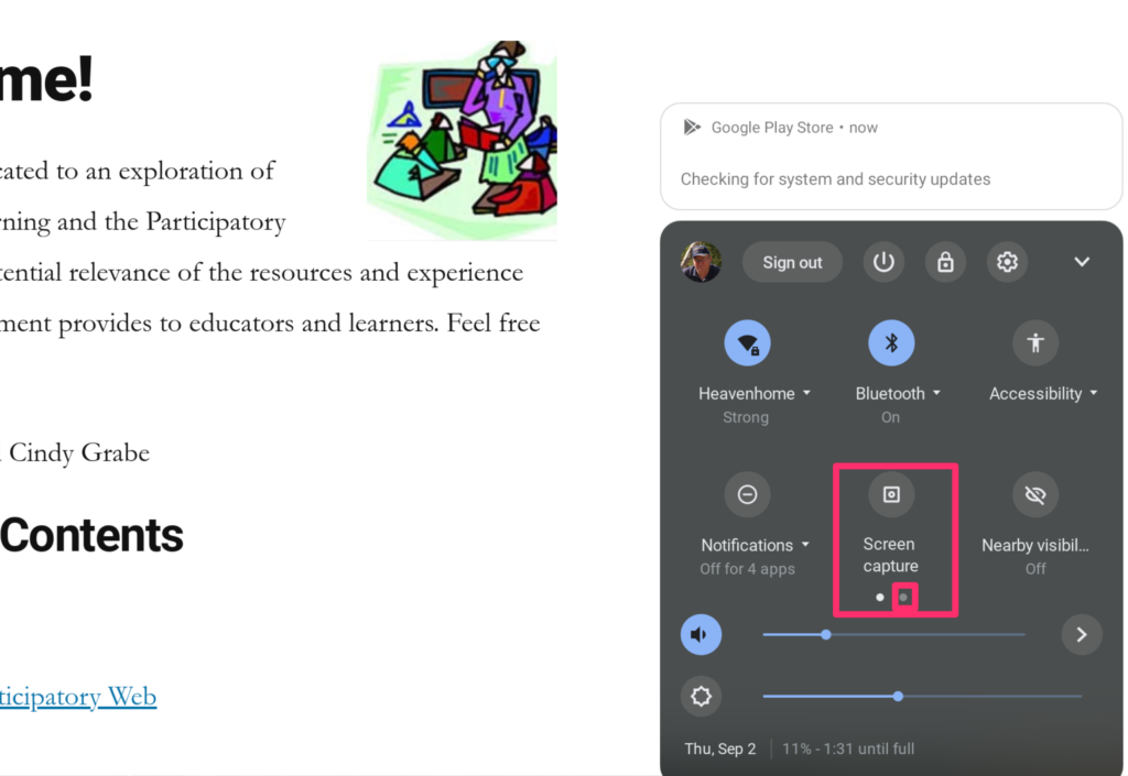
I had always assumed I had to add something to allow me to make screen recordings on my Chromebook. However, recent improvements in the OS offer a built-in video recording capability.
You activate screen recording from the popup that reveals such information as your clock, wifi strength, and internet strength at the bottom right of your screen (shift+CTRL+show windows icon for those who prefer to rely on keyboard shortcuts). The screen capture icons is then used to access the features to control screen capture and screen recording (make certain your OS is up to date).
I could not figure out how to take a screen capture of the active screen capture controls so I had to use my digital camera. Controls will appear at the bottom of the window allowing recording to be activated and to set the size of the window to be recorded. A record button will appear to start the recording. A red button appearing at the bottom of the screen is used to stop the recording.
I generate most of the recordings I create on a Mac and have typically relied on Apple’s Quicktime to do so. I know that many educators have used Screencastify to record video from their Chromebooks. Screencastify has one great feature not available in the Chrome builtin or Apple’s Quicktime, it allows an insert recorded from the computer’s camera to appear on top of the screen being recorded. This “see my teacher view” seems more appealing to me. There is a free version of ScreenCastify limited to five-minute videos. The unlimited version (for educators) is $29 (for a limited time).
Manage Consent
To provide the best experiences, we use technologies like cookies to store and/or access device information. Consenting to these technologies will allow us to process data such as browsing behavior or unique IDs on this site. Not consenting or withdrawing consent, may adversely affect certain features and functions.
Functional
Always active
The technical storage or access is strictly necessary for the legitimate purpose of enabling the use of a specific service explicitly requested by the subscriber or user, or for the sole purpose of carrying out the transmission of a communication over an electronic communications network.
Preferences
The technical storage or access is necessary for the legitimate purpose of storing preferences that are not requested by the subscriber or user.
Statistics
The technical storage or access that is used exclusively for statistical purposes.The technical storage or access that is used exclusively for anonymous statistical purposes. Without a subpoena, voluntary compliance on the part of your Internet Service Provider, or additional records from a third party, information stored or retrieved for this purpose alone cannot usually be used to identify you.
Marketing
The technical storage or access is required to create user profiles to send advertising, or to track the user on a website or across several websites for similar marketing purposes.

You must be logged in to post a comment.