I have been exploring approaches that might be used by teachers and students to individualize student progress through a sequence of learning experiences. I am interested in approaches that might allow a mastery model; i.e., students move ahead at the rate they are able to demonstrate mastery of instructional goals. Recently, I have been exploring a model called the Modern Classroom Project and I have been thinking about some of the practical requirements for implementing this model.
Approaches that individualize student progress need a way to communicate the sequence of tasks to individual students and to locate competency checks within this sequence of tasks. If I were going to do this, I would probably create a document (probably Google docs) that linked to a series of web pages to present content and layer these content pages using InsertLearning. InsertLearning would allow me to add prompts, questions, and discussion items to the content pages (which would consist of text, images, and video). I could use the questions to encourage processing of the content and also as a competency check at the end of each content page. The nice thing about InsertLearning for this type of approach is that it collects student responses to questions and I would use these responses to evaluate understanding of the content presented within a page. These responses would enable me to provide feedback to students telling them if they can move on to the next unit and to identify students I might want to spend time with to help them sort out difficulties they seem to be having.
InsertLearning is not a free service ($8 per class per month or $40 a year) so how else might a similar goal of sequencing learning be accomplished. Many educators have probably heard of hyperdocs. The term hyperdoc was coined to refer to creative use of Google tools (docs, forms, sheets, and slides) to create content delivery, learning experience, and evaluation tasks by teachers for their students. Often, this would be done in place of traditional curriculum materials which I would describe as placing classroom educators into the role of an instructional designer. One of the challenges I see in this approach is creating a simple way to allow multiple students through the sequence of an instructional unit at different speeds. My guess is that the authors of the Hyperdoc Handbook would do this through a combination of Google docs and Google forms. You can do a lot with docs because you can both present content (text, images, video) and require responses within the same shared document. The problem for me if relying on docs would be individualization. You would possibly have to create a unique copy of each doc for each student if you wanted to evaluate performance on tasks with the material to be examined added within the doc.
What follows is my attempt to use Google forms as an alternative. Forms are crude in comparison to docs, but forms have the advantage of writing the response to embedded questions to a spreadsheet. The collection of data is the primary function of a form. The link for the same form can be sent to many different individuals and inputs to questions in the form are stored separately in a spreadsheet. I think of trying to use forms for the task I am interested in as trading data collection for the sophistication of content presentation. I have come up with a few ideas in the use of forms others may find useful.
Here is a summary of the issues and my ideas. You can present text, images, video, and questions in forms, but to combine them you have to be creative. The biggest challenge is to combine text with anything else. I use WordPress as my blog platform (this blog) and WordPress now uses what are called blocks. There are blocks for lists, text, images, embeds, quotations, video, etc. and you create posts by adding blocks and then adding content to each block. Forms works in a similar way, but allows far less flexibility in how blocks can be combined.
With forms, it helps to think in terms of sections. There is the title section and sections that follow. Below each section heading, there is an opportunity to add text. You can add as much text as you want, but this is the only place within a section that text can be added. You can add multiple images, videos, and questions below this body of text. The questions are of many types, short answer, paragraph, multiple choice, etc. The responses to these questions are written to a spreadsheet that will appear in the same Google drive account that stores the form.
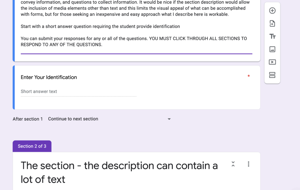
Here are a few images to give you an idea of what this looks like. The following image shows two sections – the title section and a second section. You can see text that has been inserted under the title. Again, this is the only place text can be added to this section. Below, the text you can see a question. You will need to associate an identification (name) with each response from students. So, the form I created begins with the request for a name. Questions either require a response or not. I want students to be able to complete parts of this unit (consisting of multiple sections) in stages and I want to record any input generated during that visit to the site. I require a response to the name question, but not to any questions that follow. A student can then respond to questions associated with other sections or not and I will also store these responses associated with the name or other form of identification. The student must move through all sections for the form to send any data added to the spreadsheet. This is not ideal and I am sure some students will forget to do this and no work they have completed will be recorded. There is no way to change this in a form with multiple sections. The image below shows the beginning of a second section with again allows a heading (title) and then the one opportunity to add text.

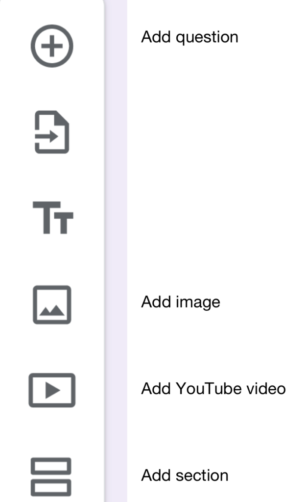
The following image shows the form tools. The tools have been labeled. There are options associated with the different tools (e.g., for questions – what type of question and will a response be required).

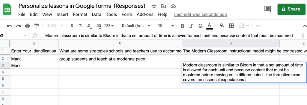
The following image shows what the spreadsheet with responses looks like. Long responses distort the shape of the spreadsheet, but clicking within a cell makes the content submitted far easier to read.

If you are interested in examining the demo form I created for this tutorial, you can view it using this link.
![]()