I was a big HyperCard fan and had a great time using the capabilities of that application to create interesting projects. I was interested in creating virtual learning environments and came up with a concept I called Grandma’s Attic. The idea was that an attic contained all kinds of content that might be regarded as historical artifacts. One could create a virtual attic and have learners explore this attic to collect information to respond to specific requests.
HyperCard offered some capabilities I cannot find in the multimedia tools now available. It had a scripting language and it made use of an object-oriented approach with some interesting capabilities. You could stack objects on top of each other and on top of a card. An object you clicked on would respond to the click if a handler existed or the click would fall through to the next layer (background, card, stack, HyperCard). So, for example, a click on an object on a card might trigger movement to a different card showing that object in a different state (say a closed book to an open book revealing text).
I was reminded of this capability and wanted to see how closely I could mimic some of these capabilities in Google Slides. If so, there would seem to be interesting capabilities for the creation of something like the virtual environments I created in HyperCard.
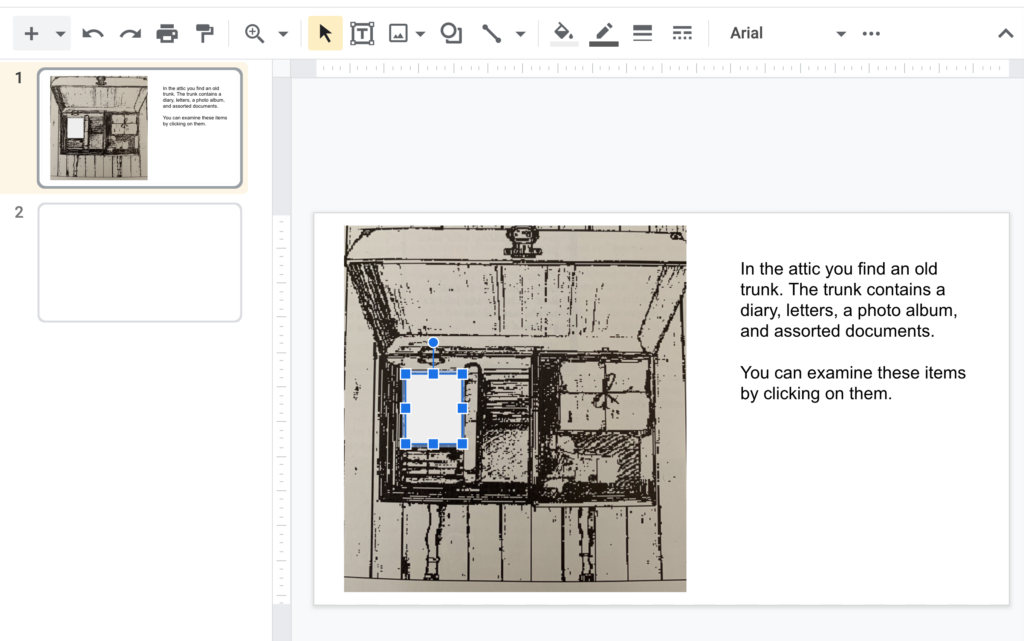
I actually found a screen capture of one of the displays from the HyperCard activity I created many years ago. One of the objects in one of the attics was a trunk containing stuff – a diary, bundle of letters, photo album, etc. It was easy to bring this image into Google Slides and then use a text box to offer some context about the image.
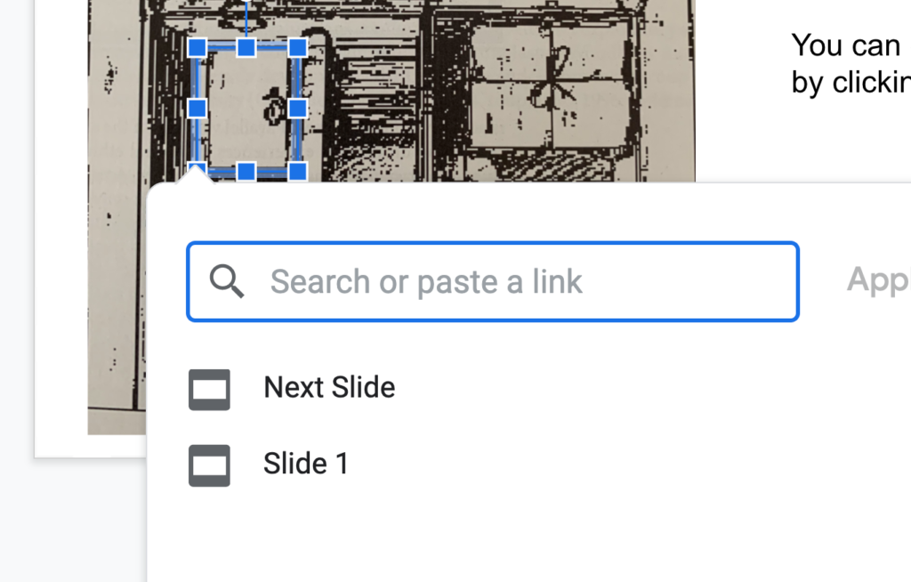
Slides has the capability of attaching links to objects. I used the square object from Objects and covered the diary.
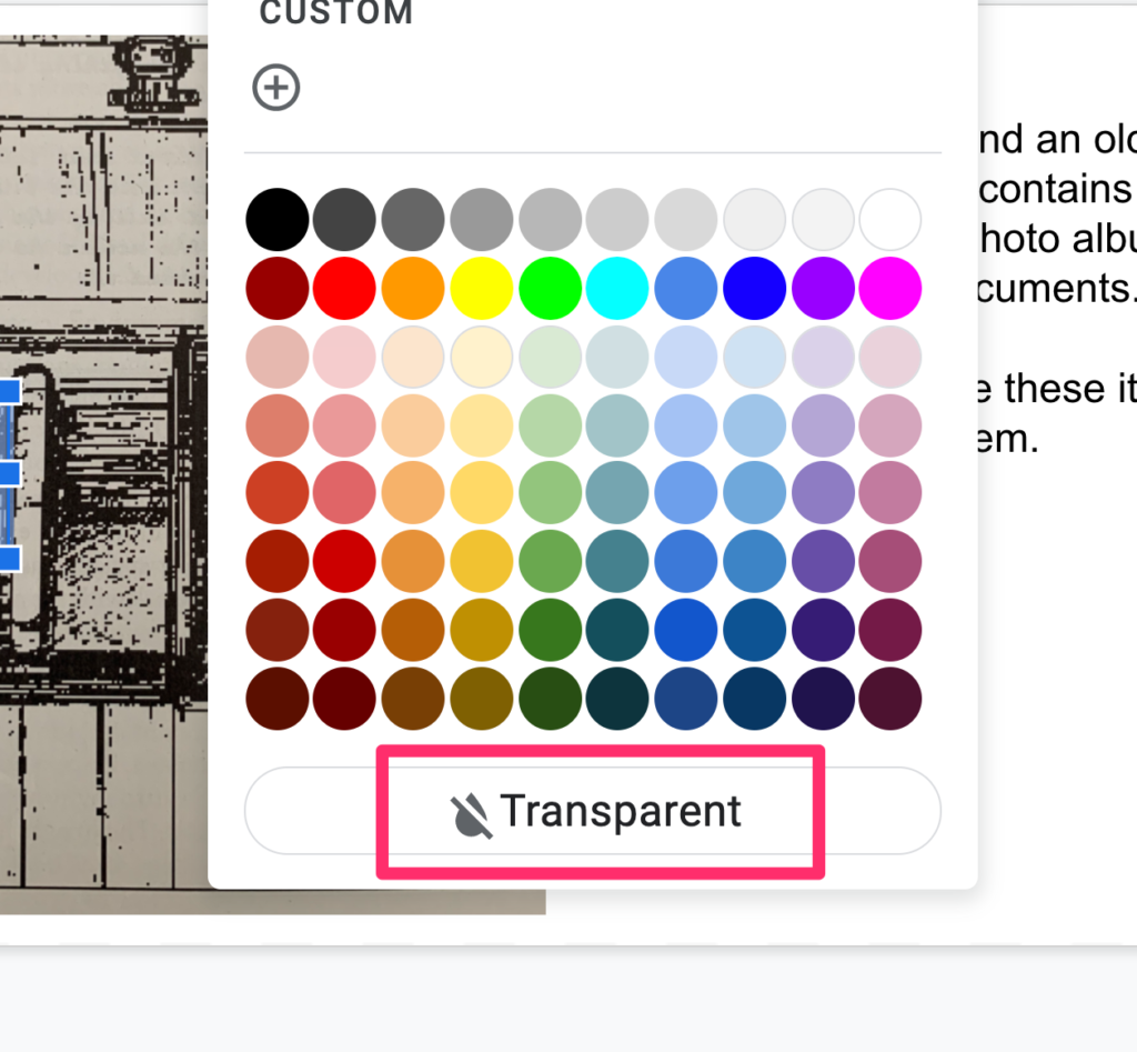
Objects can be filled with various colors. Grey seems to be the default. I wanted the square object to be invisible and found you can set the fill to transparent. A thin line does mark the location of the “invisible button”, but this seemed fine.
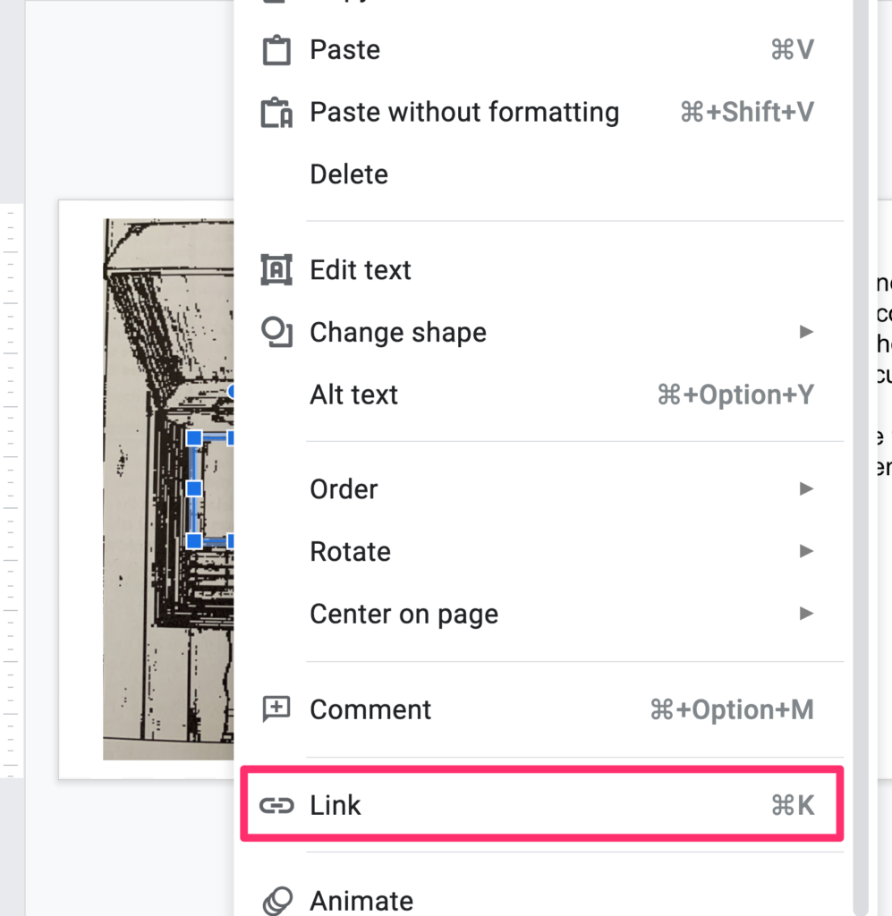
This is the tricky part because it is not obvious from the menu bars that this capability exists. If you right-click (control-click) on an object, this list of options appears. You can use the “Link” option to create an action when the shape is clicked. In this case, I wanted to sent the user to a different slide. Note that the idea would be to have multiple objects used as hotspots to send users to different slides.
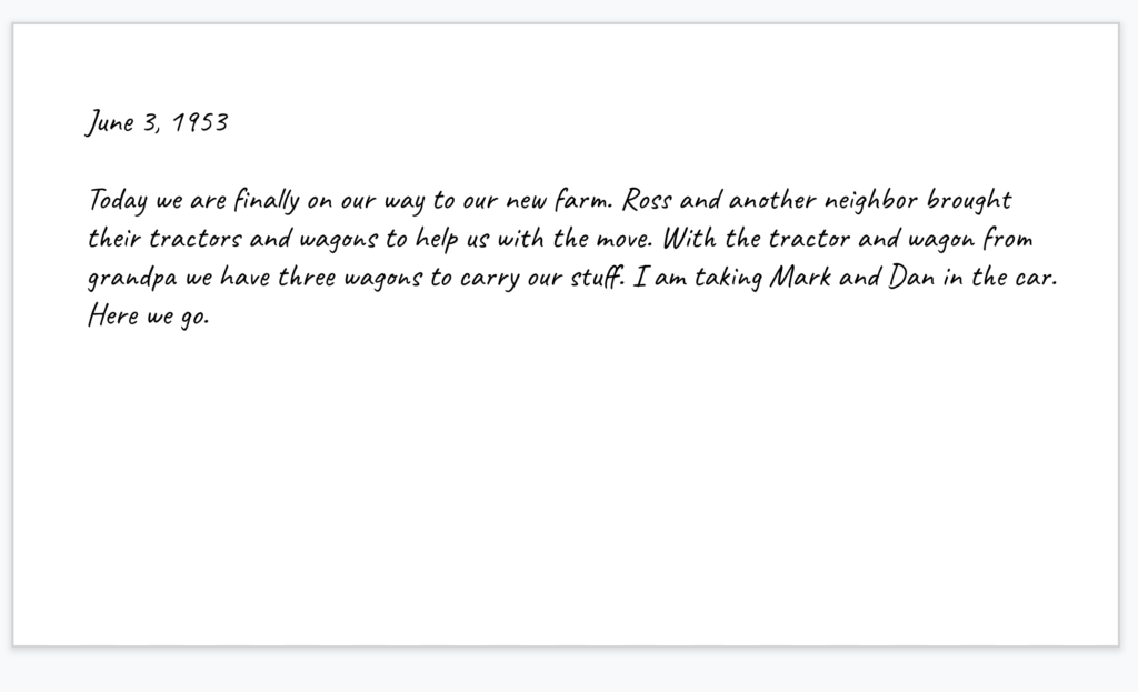
So, imagine clicking on the diary and you end up viewing a diary page (just a text field on another slide).
You do need to understand some other features of Slides to approximate what I used to do with HyperCard. First, images, shapes, text boxes appear on slides in layers. You might not notice this unless one object overlaps another. Obviously, you need the invisible button on top of the image of the diary/trunk. Use the “Order” option available in the same menu used to connect a link to an object to manipulate the order in which different objects are layered on the slide.
When you force a tool to do things the designers of that tool did not anticipate, you often have to use creative hacks to get what you want done. Here is an example. Slides is designed to advance slide to slide and not necessarily to jump around using linked buttons. You really want to disable the card to card progression if you can. In the example of the trunk, you don’t want mouse clicks on surfaces other than those covered by invisible buttons to move the experience to the next card. The next card would not necessarily make sense to the user. Here is a kludgy remedy. Start with an invisible button that covers the entire slide and link this button to the same slide. Instead of moving to the next card, clicking elsewhere on the slide will result in no change. The clicks trigges a link that takes the user to the same slide.
This is not a perfect solution as clicks on other objects that cover the all slide invisible button still move the experience to the next slide. This seems a problem that would be very tedious to fix. Perhaps changing the outline of the invisible button to something more visible would encourage willing users to click where their actions would take anticipated consequences. Not exactly the kind of expectation good designers tend to make.
This project was intended mostly as a proof of concept encouraging others to explore with slide-based systems (e.g, Google slides, PowerPoint) and see what atypical applications are possible. The example I use here is unusual, but this technique of using multiple objects to control links to multiple slides is a technique suited to many applications.
![]()

You must be logged in to post a comment.