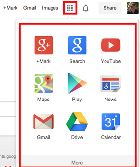
If you use the Chrome browser and Google services, you are likely familiar with the app launcher. The launcher is available from the square of blocks appearing in the header and provides easy access to the services Google must think are used most heavily.
The limitation with the launcher has been that these are not necessarily the subset of services that you use and the apps within the two sets of nine apps are not necessarily organized to meet your needs. It is now possible to customize both the Google services and the order of these services using App Launcher Customizer.
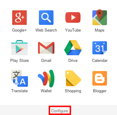
Once you add this extension to Chrome, the app launcher can be configured.
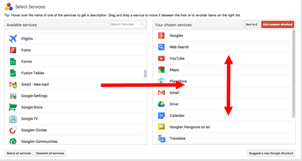
Selecting the “configure” link gives a user access to icons representing Google services and the services presently available from the launcher. You drag to add services and to reorder where they will appear in the launcher.
For example, I frequently take advantage of Google Scholar in the work I do. I can add this service and position it for easy access when I open the app launcher. This is a must have extension for heavy Chrome users.
As far as the big technology companies go, I am probably more a fan of Google than any other company. This admiration reflects how I value their products, but also how I value their way of going about doing business. Just for the record, I do not consider myself a freeloader. I pay for Google services (Google Music and general storage space) and I have purchased severely overpriced products (Chromebook Pixel) just because I wanted a particular development effort to move forward. My point – I do not expect technology companies to provide me services for free and this not the reason I support this company.
Google is obviously changing, some would say maturing, and a possible interpretation might be that they have become more focused. One tactic in implementing a more focused approach has been to cut several services. At least some number of individuals will have been users of these services and this will cause frustration.
Recently, I encountered a campaign to reconsider changes made to PicasaWeb. This service allows Google users to store photos online (a reasonable number at no cost and more storage for a small fee). I had noticed this change in that my efforts to access images I had stored as Picasa folders resulted in redirection to Google+. In my opinion, Google wants to build up Google+ as an alternative to Facebook and is making efforts to position Google+ as a kind of hub for multiple services.
The post (ironically on Google+) was brief, but it seemed to urge those who use PicasaWeb to encourage Google to maintain this service and to maintain it separate from Google+. Those who agreed were urged to + the post. Given the history of Reader, I would not be optimistic. Felix Binsack, the originator of the campaign, does have a point in indicating that he paid for PicasaWeb and I suppose while the time period covered by the payment was limited, you put work into a paid service assuming it will be continued.
I write mostly to inform those interested in the educational uses of technology and I think PicasaWeb has a number of important and useful features.
I like the connection between software on the desktop and storage in the cloud. Google provides free software you can download (Picasa) and this software can be used to take photos off your camera, organize photos, and upload those you want to store in the cloud and possibly offer to others. You can work entirely in the cloud, but if you work with hundreds of photos at a time, I think this local software is helpful.
Picasa is cross platform. I like iPhoto as well, but when you write for a broad audience (teachers) it is important to offer tactics they might apply no matter what the hardware provided for their use.
The desktop software allows flexibility in location of images on the computer. Picasa takes an approach different from iPhoto. You can store your photos where you want on your computer and still work with them using Picasa.
My experience with Google+ had not included a lot of activity using the built in photo tools. I admit after a little exploring I was more impressed. Google+ does allow the organization of photos in folders and allows the sharing of photos with a designated circle (or the general public). The organization, annotation, and sharing of photos are major issues for me when it comes for the educational potential of digital photography.
Here is a brief explanation of how to organize Google+ photos into folders. On the iPad, the process of organization would work something like this. While viewing a photo, select the “gear” icon and then select the “copy to folder” option from the options you are presented.
You will then select an existing folder or be allowed to create a new folder.
The process from a computer works a little differently. With a photo selected, you should have access to a “More” menu and you select “add to a folder”.
Clearly, creating folders and adding images to folders can be accomplished within Google+. I will also accept that the batch processes available from Picasa would make the process of organization more efficient.
The generation and utilization of educational content has long been a personal interest. We have been lucky enough to have a book available since the mid-90s. We split with our publisher a couple of years ago because we wanted to explore a smaller and less expensive book in combination with more online content. We were able to implement our plan by securing our copyright and updating our material as a Kindle ebook and online content.
We selected Kindle because it was cross platform with the iBook being limited to the iPad at that time. However, the flexibility of the iBook is attractive and iBook Author appears to be a great platform for generating content.
While I really like the iBook author platform, I do not get the Apple ibook plan. It does not seem suited to those of us who write for higher education courses because while you can expect students to have some type of device, you cannot really assume it will be an Apple product (now iPad or a system running Mavericks).
There is also the matter of price to the reader. I did a quick comparison of Kindle and iBook prices for the books I have finished within the last two months and the Kindle version is always a little lower. While I do most of my reading on an iPad, I read none of these books as an iBook.
Making thinking visible – 18.96, 19.99
Invent to learn – 9.99, NA
Reign of error – 11.99, 14.99
Teaching minds – 14.55, NA
One Click – 7.99, 9.99
The everything store – 10.99, 10.99
The mushroom hunters – 11.84, 11.99
The circle – 6.50 6.99
Higher cost and fewer hardware options for experiencing the content seems a bad combination to me.
A book that goes beyond text must be where Apple sees this going. Clearly, the present Kindle books are far more limited as far as this potential goes. However, none of the books I just listed here would have benefited from a more flexible format.
The kind of product that would really take advantage of the iBook format would be very expensive to generate for the college market. Multimedia content requires more sophistication involving multiple experts and typically requires a careful approach to the acquisition of permissions. It was the issue of permissions in combination with our desire to generate a far less expensive book that let to our break with our publisher. Even if an individual could generate a more complex product there are always those issues that require lawyers in a commercial venture. An approach that primarily relies on text is just easier to generate. Professional help such as a good editor can greatly improve the work of any author, but that is about all you need with a Kindle book.
Our plan is to revise our present book this summer for both platforms. If you tell yourself this is about exploring and not about money or time, it is sufficient to enjoy the creative process. The plan is to offer a Kindle plus online content version and an iBook version that incorporates more of the content we presently provide online. We will see how it goes.
It seems to me that there are a whole bunch of Twitter-based edchats being launched. I don’t get it. My attitude will likely be attributed to various things including being out of date, stuck in the past, inflexible, etc., but I think I have reasonable objections. I do not see Twitter suited to carrying on group conversations.
While I certainly applaud the commitment and the intent, I have two objections. I do not see the real-time, group-based communications value in Twitter and I think the chats introduce unproductive clutter into the Twitter stream for nonparticipants. Given the available options, the interest in Twitter chats seems more a focus on the tool or the trend rather than on the goal of effective communication.
Unproductive communication
As evidence for the suitability of Twitter to group discussion, I would encourage any interested party to examine the transcript from such a discussion. Do you really think the accumulated comments indicate deep thinking or even a reasonable volume of ideas for the collective time invested?
Typically, a Twitter discussion is controlled by one of the participants who posts some predetermined questions intended to generate comments and who makes decisions when to move on from one question to the next. Even with the short responses that are allowed, participants seem to be at different levels when it comes to keyboarding skills and existing thinking regarding the questions. What you get as a consequence is a hodgepodge of replies – some to the question, some in reaction to comments made by other participants, some to a previous question, and some for socializing. Responses are often abbreviated to allow quicker reply and to meet the limited space Twitter allows. It also seems to me that the limits on expression generate overuse of platitudes rather than original personal thoughts. What these platitudes are will vary depending on the makeup of the group, but the comments are predictable “in” things to say and add little beyond restating group values.
For some reason, many of the issues here remind me of the research on wait time in classroom discussions. We know that moderating a classroom discussion is more complicated than most might guess and productive discussions require more than posing a series of questions. Participants need time to think (the wait time issue refers to the common counter intuitive problem of not actually providing sufficient time to think and respond). Participants need to be encouraged to evaluate the responses generated by other participants. Some participants need to be encouraged. While wait time is not a pedagogical skill as such, the lack of wait time (perhaps think time would be more meaningful) changes the nature of the discussion process. Pretty much only “low level” thinking is possible when time is not allowed. My point is that it is important to consider how basic variables may shape the goals that can be achieved.
Annoying presence
Clearly, Twitter encourages a lot of inane comments. Remember the original question – what are you doing? Everyone seems enabled to seek their 140 characters of fame. This is not really a problem for me – the tool was designed assuming such goals.
Within the general Twitter environment why would I claim any given activity is particularly annoying? I have the same reaction to viewing part of a conversation on Twitter that I have to being forced to listen to one side of a cell phone conversation. I think we all have developed some level of tolerance, but beyond some point the partial conversation becomes annoying. We may expect the person on the cell phone to step out of the coffee shop if the conversation is going to be continued for some time. Likewise, we may expect Twitter users to move to some other means of conversation if many back and forth comments are essential.
Alternatives
It is not really fair to be critical unless you can also offer alternatives. I am of the opinion that Twitter is fatally flawed for the purpose of meaningful discussion. I do not see this tool as being designed for this purpose.
I do feel other tools make more sense.
The traditional discussion board makes would seem to be more productive if the approach is to consider several guiding questions. With this tool, there is no time limit allowing for individual differences in speed of response. The reply and reply to reply features allows a way to organize the output in a way that encourages review and extended interaction – connections among ideas are far more obvious.
For real time conversation, I am a fan of Google+ hangouts. With speech rather than text input, we can express ourselves more easily and we can rely on our experience in conversing to connect our comments. Text comments can be integrated/added if necessary. The use of “circles” allows participants to isolate themselves in a way that does not spam nonparticipants.
If I am correct about the utility of Twitter for chats, this fad will pass and we will move on to other tools.
I have posted a couple of pictures from one of my trail cams before, but I have some new images that are more unusual. A trail cam is a camera that is triggered by motion. Hunters often use these cameras to scout areas for game, but there would seem to be many possible applications including just surveying local wildlife.
Two images I just downloaded follow. The first image shows two grey fox and the second a lynx. This camera set was about 1/4 mile from our lake home in Wisconsin.
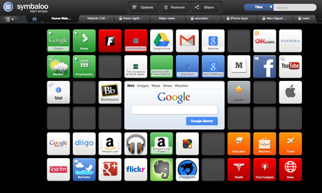
Google shut down iGoogle on Nov. 1. This was not a surprise since they told us months ago and for the past month or so those of us who used iGoogle were reminded by a message each time we open the page. Even so with the date of doom finally here, there were many suggestions for alternatives. In September, I recommended Symbaloo as a replacement and this seemed to be the most common recommendation. With several months of experience with Symbaloo and a second look at the alternatives, I think I have a new strategy.
Symbaloo is great way to launch online services. An array of buttons, usually with the icons representing the services, appear as your home page. You can even create multiple pages and share individual pages much like you might create a Pinterest page.
What I missed from iGoogle was information. iGoogle allowed gadgets that embedded other web information services within the page – little feeds representing your email, stock quotes, your calendar, etc. It was combination of links to services and these information feeds that made iGoogle useful. There was a lot there in a small space.
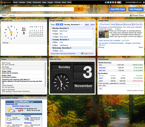
igHome is one of the start pages alternatives I considered, but orginally rejected. It offers the opportunity to create a page using gadgets and most of the information feeds available in iGoogle.
Here is a new strategy I think offers an improvement over any given service. My new strategy takes advantage of the capability of Chrome to specify multiple start pages – each in a separate tab. I now launch both Symbaloo and igHome at the same time and easily switch back and forth. The order in which the pages are listed determines which page appears “on top”.
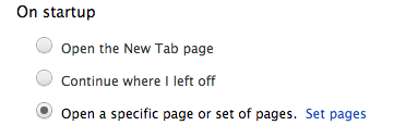
To create this system, you will need to open “Settings”. Locate the section of the settings that concern startup options.
The set pages options allow multiple pages to be designated.
Manage Consent
To provide the best experiences, we use technologies like cookies to store and/or access device information. Consenting to these technologies will allow us to process data such as browsing behavior or unique IDs on this site. Not consenting or withdrawing consent, may adversely affect certain features and functions.
Functional
Always active
The technical storage or access is strictly necessary for the legitimate purpose of enabling the use of a specific service explicitly requested by the subscriber or user, or for the sole purpose of carrying out the transmission of a communication over an electronic communications network.
Preferences
The technical storage or access is necessary for the legitimate purpose of storing preferences that are not requested by the subscriber or user.
Statistics
The technical storage or access that is used exclusively for statistical purposes.The technical storage or access that is used exclusively for anonymous statistical purposes. Without a subpoena, voluntary compliance on the part of your Internet Service Provider, or additional records from a third party, information stored or retrieved for this purpose alone cannot usually be used to identify you.
Marketing
The technical storage or access is required to create user profiles to send advertising, or to track the user on a website or across several websites for similar marketing purposes.


You must be logged in to post a comment.