I ran across a post on LifeHacker describing an interesting election season technology project. The basic idea was to identify links leading to conservative or liberal sites. Conveniently, the add-on color codes the links (blue, pink, red).
The colors don’t necessarily represent each blogger’s personal views or biases. It’s a reflection of their linking activity. The algorithm looks at the stories that bloggers linked to before, relative to all other bloggers, and groups them accordingly. People that link to things that only conservatives find interesting will be classified as bright red, even if they are personally moderate or liberal, and vice-versa.
The project is described at Waxy and is based on a three-month collection of link history borrowed from Memorandum (a political web information portal). The technique is interesting to read about and I think I might even understand how it works if I spent a little more time. Think of it this way – the approach defines an orientation by the associations (i.e., links) they keep. You can play with an exploration tool they make available. As I understand it (and from my limited experience using it), the tool calls upon the database they have created and will color code the link if that link is in the database. Don’t expect to explore your local newspaper to determine which direction it leans. The Memorandum site works the best because this was the basis for the project.
I happen only to have Safari on the machine I was working on when exploring this site. The add-on available from Waxy does not work with Safari, but a link to Daytime Running Lights provided a bookmarklet that does. This post also suggested that the exploration of Google News.
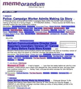
The following screen capture will give you an idea what applying this tool (to Memorandum – the ideal target) generates.
It occurred to me that this tool could be the basis for some interesting classroom activities. The Bionic Teacher must also read LifeHacker because I was not the first with this insight.
What an opportunity to consider some topics in digital literacy (e.g., media bias). Just for kicks I did a search for Fox News in Google and then applied the tool. Nearly all of the links turned red. “Fair and Balanced” and red. I searched for CNN and found that nearly all links turned blue. NPR – mostly blue.
Cool!
![]()
